A Detailed Guide to Selecting The Right Curtain Color Combination For Any Room
Quick answer: Curtains almost never work as an isolated choice. They are the 30% secondary color in the classic 60-30-10 design ratio (60% dominant, usually walls; 30% secondary, usually curtains, furniture, or rugs; 10% accent, like cushions or art) so start from your wall color, not the curtain swatch. In Dubai and Abu Dhabi homes specifically, curtain color also affects heat: darker, low-reflectance fabrics absorb more solar heat through south and west-facing glass, so pair dark tones with a thermal or blackout lining rather than skipping the lining to save cost. For layering ideas once you have picked a color, see our guide to hanging curtains correctly and our breakdown of blackout curtain construction.
Start With the 60-30-10 Rule, Not the Curtain Swatch
Professional colorists split a room’s palette into three proportions: 60% dominant color (walls and large surfaces), 30% secondary color (curtains, upholstered furniture, an accent wall, or a large rug), and 10% accent color (cushions, lamps, artwork, small decor). Curtains sit in that 30% band, which means their job is to support the wall color, not compete with it.
In practice this means two safe paths. If your walls are a light neutral (white, cream, greige), your curtains can carry more color and depth — navy, forest green, terracotta, or a warm charcoal all read as intentional rather than heavy. If your walls already carry color or a bold accent wall exists, curtains should pull back toward a lighter, quieter tone in the same undertone family so the room doesn’t fight itself.
Light Reflectance Value: The Number Behind “Light Colors Open Up a Room”
Every color has a Light Reflectance Value (LRV), a 0-100 scale describing how much visible light a surface bounces back versus absorbs. A pure black finish sits near 0 LRV (absorbs almost all light), while a bright white sits near 100 (reflects almost all of it). This is the actual mechanism behind two common design claims, and it’s worth separating fact from folklore:
- Perceived size: a high-LRV curtain (ivory, soft white, pale linen) bounces more daylight around the room, which reads as brighter and more open — genuinely useful in a small or low-light room.
- Heat: a low-LRV curtain (navy, charcoal, deep maroon) absorbs more of the sunlight that hits it, and in direct UAE sun that fabric can get noticeably warmer to the touch than a light one. This matters most on south- and west-facing windows that take afternoon sun. It doesn’t mean avoid dark curtains — it means pair them with a proper blackout or thermal-backed lining so the heat load is managed by the lining, not radiated straight through into the room.
Match Undertone Before You Match Color
Undertone — the subtle warm (yellow, orange, red) or cool (blue, green, grey) cast beneath a color’s main hue — causes more mismatched rooms than the wrong color choice ever does. A greige wall with a pink undertone next to a curtain with a yellow undertone will look “off” even if both are technically “beige.”
| If your wall/furniture undertone is… | Choose curtains with… | Avoid |
|---|---|---|
| Warm (cream, sand, honey wood) | Warm neutrals, terracotta, olive, warm charcoal | Cool grey, icy blue, stark white |
| Cool (grey, white, cool wood tones) | Cool blues, sage, cool-toned neutrals | Warm gold, orange-brown, cream |
| Neutral/greige | Almost any tone, since greige bridges both | Very saturated warm and cool tones side by side |
Four Reliable Color-Pairing Strategies
If you want a scheme that looks designed rather than accidental, pick one of these four approaches rather than choosing curtains on instinct alone:
- Monochromatic: curtains in a deeper or lighter shade of the wall color. Lowest risk, always cohesive, best for small rooms or renters who want a calm result.
- Analogous: curtains in a color next to the wall color on the color wheel (e.g., blue walls with teal or blue-green curtains). Adds interest without visual tension.
- Complementary: curtains in the color opposite the wall on the color wheel (e.g., blue walls with warm terracotta curtains). Highest impact, best used in living and dining rooms rather than bedrooms.
- Neutral anchor: curtains in a neutral (linen, taupe, soft grey) regardless of wall color, with the room’s real color statement carried by cushions, art, or a rug instead. The safest option when you’re not confident mixing color.
Room-by-Room Guidance
Bedroom: prioritize function over pure color theory here — a full blackout lining matters more than the exact shade for sleep quality. Within that, muted, low-saturation tones (dusty blue, sage, warm taupe) support rest better than high-contrast or highly saturated color. See our note on bedroom curtain color and sleep for the fuller picture.
Living room: the room where the complementary or accent-heavy approach pays off most, since it’s a shared, active space. Olive, warm terracotta, or a deep jewel tone against neutral walls reads as a deliberate design choice rather than decoration for its own sake.
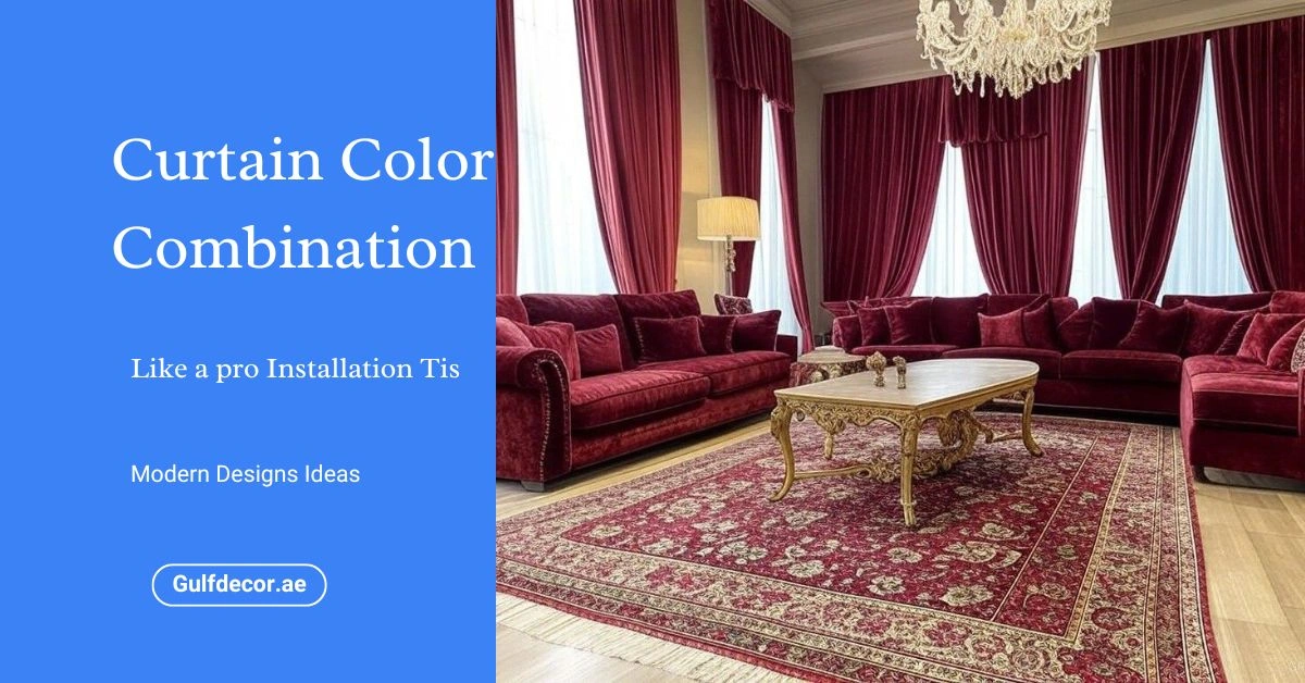
Dining room: darker, richer tones (deep red, plum, bottle green) suit dining rooms because the room is used mainly in the evening under artificial light, where deep colors look intimate rather than heavy. Pair with a dimmable fixture — see our chandelier sizing guide if you’re planning the lighting alongside the curtains.
Home office / study: cooler, lower-saturation tones (charcoal, navy, cool grey) measurably support focus better than bright, busy colors, which is why most professional office design defaults to a muted palette.
Using Pattern Without It Looking Busy
The rule that actually holds up: match pattern intensity to the room’s existing pattern load, not to a single “rule” about walls versus furniture. If your upholstery, rug, and wallpaper are already patterned, a solid curtain lets the eye rest. If the room is otherwise solid-colored, a patterned curtain (stripe, subtle geometric, botanical) becomes the room’s one point of visual interest rather than competing with three other patterns at once. Large-scale prints suit large windows and rooms; keep prints smaller in tight spaces where a big-scale pattern will look cramped rather than bold.
Frequently Asked Questions
Do dark curtains really make a room hotter?
The fabric itself absorbs more solar heat if it has a low LRV, but a proper blackout or thermal lining blocks that heat from radiating into the room regardless of the face color. Choose the color you want and make sure it’s backed with a real lining rather than avoiding dark colors altogether.
Should curtains match the walls or contrast with them?
Neither extreme works well. Curtains should relate to the wall color’s undertone (warm with warm, cool with cool) while sitting at a different depth or saturation — a shade or two darker, lighter, or a complementary hue — so the room reads as coordinated rather than matched head-to-toe or clashing.
What curtain color works in almost any room?
A warm, mid-tone neutral — linen, taupe, oatmeal — works in the widest range of wall colors and lighting conditions because it has no strong undertone to clash and a moderate LRV that neither disappears nor overheats the space.
Does the direction a window faces change which color I should pick?
It changes how the color reads, not which color is “correct.” East-facing rooms get cool, bright morning light that can make cool curtain tones look slightly flat by afternoon; west-facing rooms get warm, golden light that flatters warm tones but intensifies how hot a dark, low-LRV fabric feels by the window in the late afternoon.
Editorial note: Color and undertone matching is genuinely subjective past the physics of LRV and the color wheel — the pairings above reflect standard interior design practice as of 2026, not a single fixed rule. When in doubt, test a fabric swatch against your wall in both morning and evening light before committing to a full curtain order.